Showcase
BHT Rebranding: A System for Modern Travel
Okee Agency • Baku Holiday Travel • 2026
Insight
In the local market, travel planning often feels more stressful than inspiring. Users usually switch between different platforms for flights, hotels, tours and other travel needs, turning what should be an exciting experience into a complicated process. More options existed, but not more clarity.
At the same time, this was not only a local product. BHT was built with ambitions for both the Azerbaijani market and international audiences. That meant the identity needed to feel culturally relevant at home, while also looking familiar, credible and competitive on a global stage.
Modern travelers everywhere are drawn to brands that feel simple, intuitive and emotionally positive. In a category crowded with similar visual languages, memorability and ease became more valuable than complexity.
BHT’s opportunity was to create a brand system that could speak to local users today while being ready for international growth tomorrow, making travel feel clearer, friendlier and easier to navigate across markets.
Idea
The core idea behind the logo was to create something simple, iconic and instantly memorable. From the beginning, the goal was not to design a complicated symbol, but a minimal identity that people could recognize, remember and recall immediately.
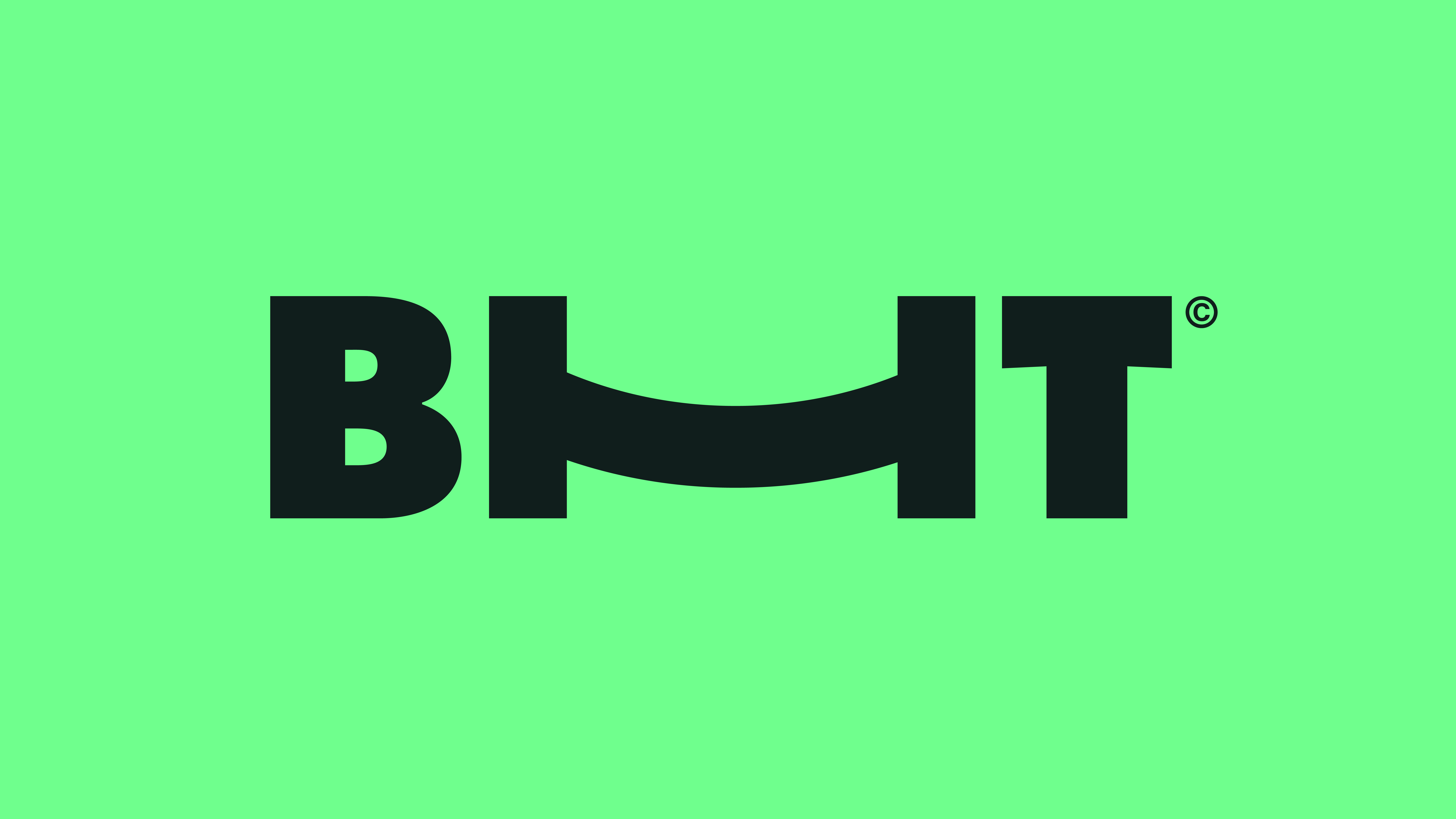
Within the name BHT, “Baku” and “Travel” are familiar category words, but Holiday is the distinctive element that gives the brand its personality and emotional value. That is why the visual emphasis was placed on the H — transforming it into the heart of the identity system.
The custom H icon was designed to carry multiple meanings: a smile for joy, a bridge for connection, and a bed for comfort and hospitality. This made the mark more than a logo — it became a flexible brand asset.
Most importantly, the symbol was built to extend beyond the wordmark and scale across the entire branding system. Its curves, rhythm and shape language were adapted into layouts, campaigns, motion graphics and visual assets, allowing one simple icon to power a complete and recognizable brand world.
Execution
We approached BHT as a full transformation project, starting long before visual design. The first phase focused on deep immersion into the business itself. Our team worked closely with Baku Holiday Travel internally, spending time inside the company to understand its structure, workflows, customer behavior, service model and real operational dynamics. This allowed us to move beyond assumptions and build the brand from genuine business insight.
We analyzed how different customer categories interacted with the product, what they valued most, where friction existed, and how expectations differed between local and international travelers. After gathering these learnings, we built a focused strategic framework and used focus-group thinking to shape the core positioning, communication priorities and user-centered direction of the rebrand.
Once the strategic foundation was clear, we moved into identity creation. We designed a simple but iconic logo system centered around the custom “H” symbol — representing a smile, a bridge and a bed. This became the foundation of the brand story, combining emotion, connection and comfort in one memorable form.
From there, we developed the complete brand book: typography, color palette, icon sets, layout logic, brand rules and scalable applications. Every element was created to feel distinctive and highly recognizable. While many travel brands globally rely on predictable blue palettes and generic visuals, we intentionally built a fresher, more ownable design language that stood out while remaining accessible and user-friendly.
The system was then extended across real touchpoints: website direction, social media templates, campaign creatives, outdoor applications, promotional materials and future-ready digital assets. The custom symbol and visual language were designed to scale consistently across every platform.
The result was not just a logo launch, but a complete brand ecosystem, built to perform locally, compete globally and grow with the business over time.
Impact
The rebrand gave BHT a stronger and more credible market presence, helping reposition the business from a conventional travel company into a modern digital-first travel platform. Internally, it created a clearer strategic direction and a unified identity system that could be used consistently across all channels.
The new brand language improved recognition through a more distinctive logo, memorable visual assets and a stronger personality in a highly competitive category. It also gave the company a scalable foundation for future campaigns, product growth and international expansion.
From an audience perspective, the identity was designed to connect with both local users and global travelers — balancing trust, accessibility and modern appeal. Early reactions highlighted the freshness of the visual direction, the originality of the logo system and the premium feel of the brand.
Most importantly, the project transformed branding into a business asset: a system that supports communication, improves perception and increases long-term brand value.