Showcase
AzerGold 10th Anniversary Brand Identity
Element • AzerGold CJSC • 2026
Insight
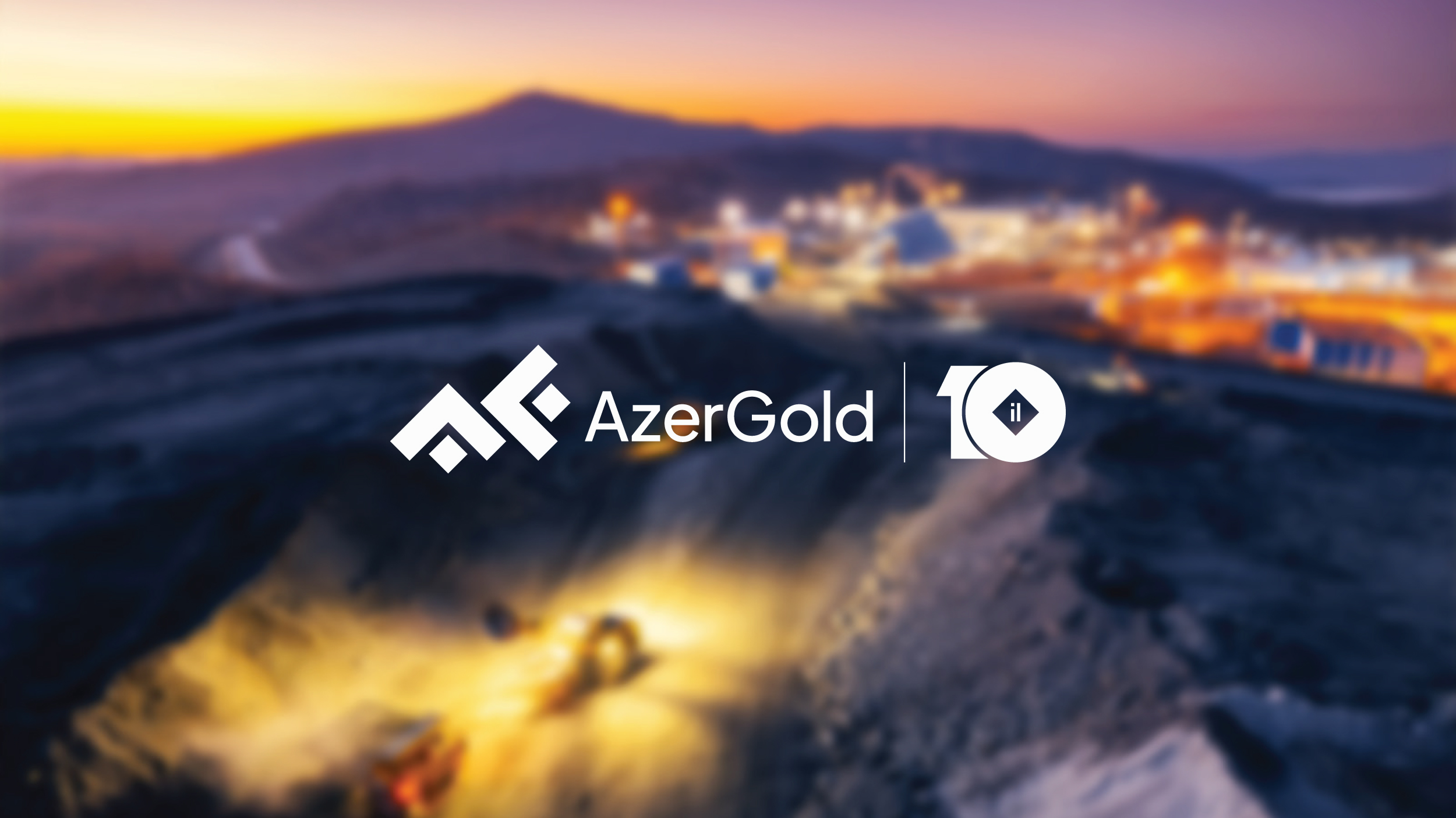
The key insight is that a mine is not merely an underground resource. Each layer represents an individual form of value that is built over time. AzerGold is the entity that uncovers and systematically manages these values. This perspective is visually reflected in the structure of the logo.
Idea
The concept is built around “From Depth to Value.”
Mining is not just extraction. It is a gradual process of turning depth into value. The layered structure in the logo represents geological strata, visualizing this transformation. The ten layers reflect AzerGold’s 10-year development journey.
At the same time, the logotype was refined with a more modern and balanced typography, improving overall visual stability and giving the brand a more contemporary presence.
Execution
The visual approach was inspired by the natural structure of mines. Layers were arranged in a clear and balanced system to express both depth and growth. In the anniversary mark, the “0” was designed as a mine cavity, while the “1” represents direction and progress.
This approach extended beyond the logo. A flexible visual system was built around the “10,” allowing dynamic use across different applications, from posters to digital platforms. The “From Depth to Value” idea was also reflected in corporate gifts and packaging, both conceptually and visually.
Impact
As a result, the logo now communicates AzerGold’s activity in a clearer and more comprehensible way. The layers, the concept of depth, and the “10” symbol together express both the company’s journey and the value it has created. The logo has evolved from a simple identity element into a visual language that explains the brand’s activity, thereby strengthening its overall image.