Showcase
Azercell DigiMax
Maverick LLC • Azercell Telecom LLC • 2026
Insight
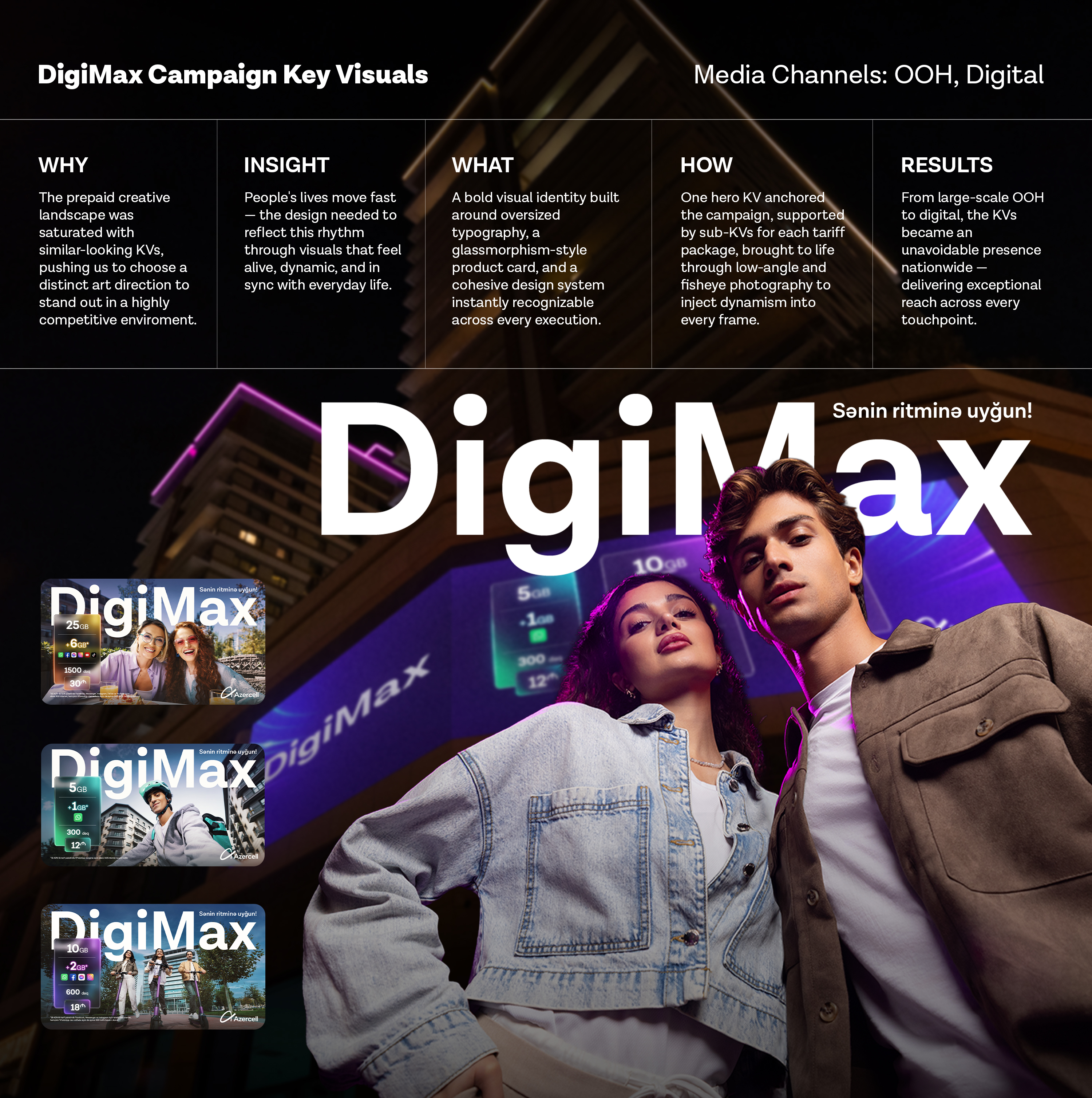
Life today moves fast and constantly evolves. People naturally adapt — choosing smarter, more flexible solutions without even noticing. This isn't just change, it's rhythm. The design needed to reflect this — visuals that feel alive, dynamic, and in sync with how people move through their everyday lives.
Idea
DigiMax was positioned not just as a tariff, but as a next-generation solution built around real life. The visual identity mirrored this — built around a bold, ownable design language where oversized "DigiMax" typography dominated every frame, functioning as both a brand mark and a design element. A glassmorphism-style product card carried the tariff details cleanly across executions, adapting its color palette to match each execution's mood while keeping the system instantly recognizable.
Execution
One hero KV was developed as the visual anchor of the campaign, supported by a series of sub-KVs each dedicated to an individual tariff package. The KV system was designed to stretch across diverse audience segments and life moments, with each execution reflecting a distinct lifestyle to make the product feel personally relevant. Low-angle and fisheye photography techniques were deliberately chosen to inject dynamism and flexibility into every frame, translating the campaign's rhythm concept into something visually felt.
Impact
The DigiMax visual identity proved its strength across every touchpoint — from large-scale OOH placements to digital channels, the KVs caught attention nationwide and became an unavoidable presence in people's daily lives. The campaign achieved record-breaking video views, exceptional reach, and strong audience interaction, with digital performance exceeding all benchmarks. With over 247 million video views and massive reach across platforms, DigiMax set a new standard for what bold, consistent design can deliver in an integrated campaign.